Brand Naming & Identity - Copy Writer - Campaign Strategy - Videography & Editing
UAL Art Foundation Final Project 2021-22
Challenge: For my final project, I chose to tackle period poverty. I created the brand identity ‘equip’ and a campaign to raise awareness of how common period poverty is to help remove the taboo around this topic.

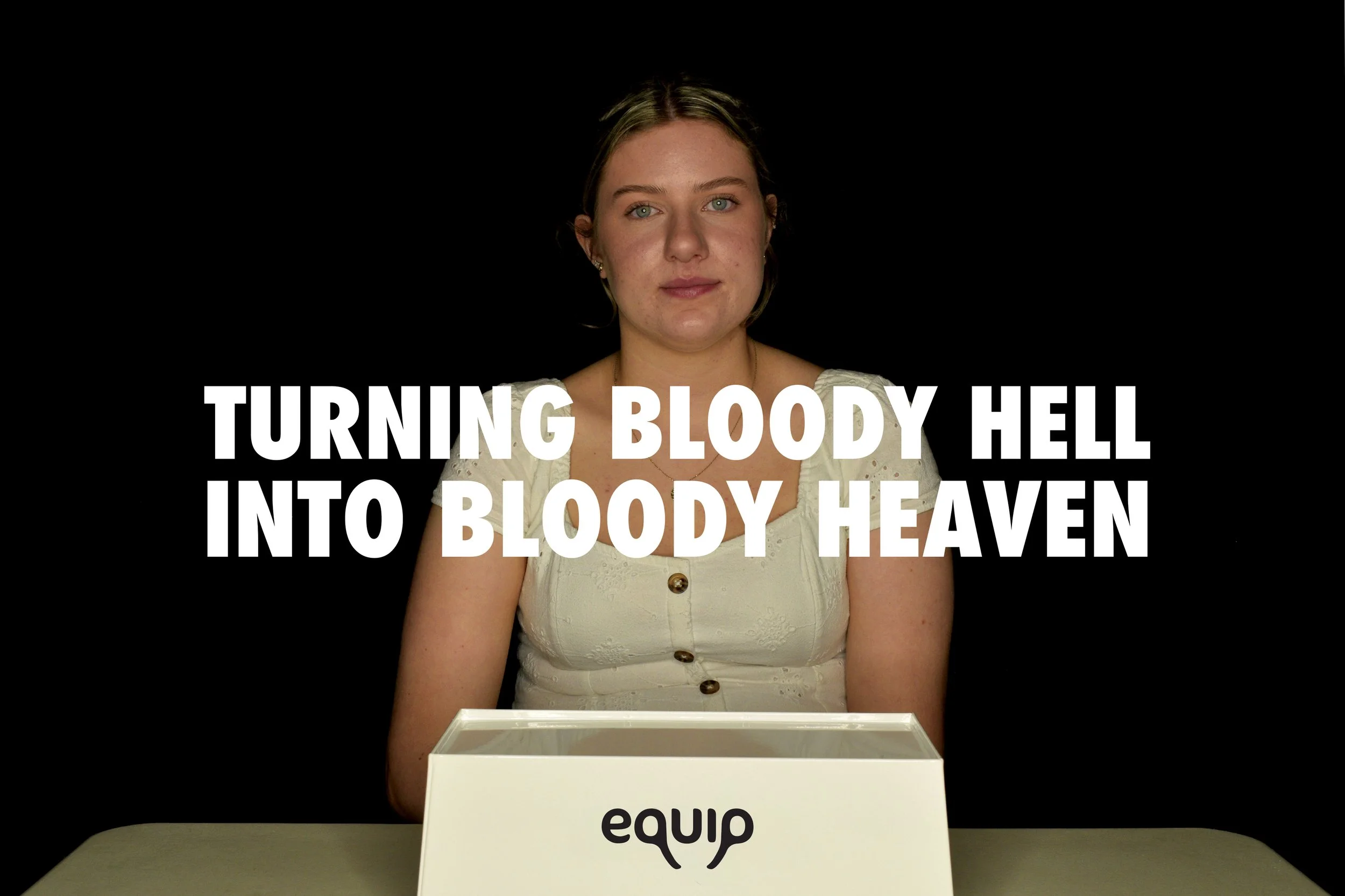
#BloodyHellBloodyHeaven
The video campaign aims to highlight the urgent need to take action in combating period poverty. The campaign sheds light on the awful circumstances and conditions people suffering from period poverty face. It aims to turn people’s bloody hell into bloody heaven. No one should have to resort to such drastic actions as highlighted in my campaign. There is one simple solution to this problem - free period products!

2021 Logo
Updated Logo
The wordmark still has hidden references in it such as the ovaries being depicted by the ‘q’ and ‘p’, the half bowl in the ‘u’ being the shape of a sanitary pad, the ‘i’ being a tampon and the title of the ‘i’ being a drop of blood. The counters of all the letters feature this drop shape to link it to the ‘i’.

The original logo was designed when I was 17/18 years old and didn’t know how to use Adobe Illustrator. The updated logo is a refined version of my original concept but is more legible and professional.